The Simulation Outputs section presents the results of the Sustainability project in the form of graphs and maps. We ran simulations for three different harvesting levels and five different percentages of intensively managed plantations (IMP). We assumed harvesting levels of 1.2, 1.5, and 1.8 billion cubic feet per year and 0% (Raw FIA), 25%, 50%, 75%, and 100% of artificially regenerated stands going to IMPs. There is one book of graphs and maps for each of the 15 resulting combinations.
You can open the contents list of any of the books by clicking on either
the ![]() or the
or the ![]() in one of the book
choices, such as
in one of the book
choices, such as ![]()
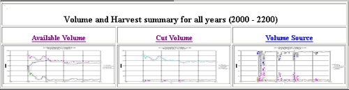
The resulting contents list gives several options. The first is ![]() , which will take you to volume and harvest graphs (See example in Fig 1
below) showing the estimated available volumes, and the estimated cut volumes and wood
source types for the state of Georgia for the 200-year period between 2000 and
2200.
, which will take you to volume and harvest graphs (See example in Fig 1
below) showing the estimated available volumes, and the estimated cut volumes and wood
source types for the state of Georgia for the 200-year period between 2000 and
2200.
| Figure 1: Example of Volume and Harvest summary graph for all years (image size adjusted for tutorial) |
 |
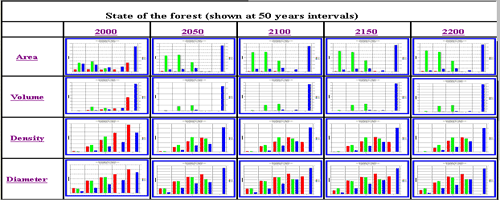
Directly beneath these graphs you will see twenty bar graphs (See example in Fig 2below) showing forest area, volume, density and diameter at 50-year intervals from the year 2000 to 2200 for the given assumptions of X.X billion cubic feet per year being harvested and X.X% of artificially regenerated stands going to intensive management.
| Figure 2: Example of a 50-year-interval, state-of-the-forest graph containing 20 bar graphs (image size adjusted for tutorial) |
 |
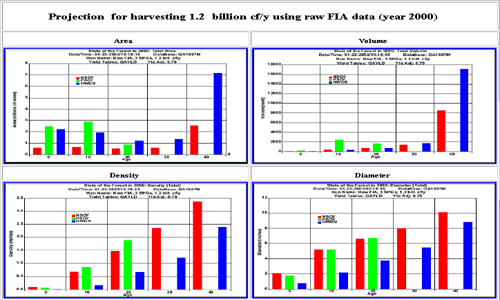
Referring now back to the book contents list, if you click on any of the four
attributes in the ![]() option
(further defined here), you will be taken to a page with five graphs, one for each of the five
simulation years and for just the attribute that you selected (See Example in
Figure 3 below).
option
(further defined here), you will be taken to a page with five graphs, one for each of the five
simulation years and for just the attribute that you selected (See Example in
Figure 3 below).
| Figure 3: Example showing a 50-year-interval, Area graph (image size adjusted for tutorial) |
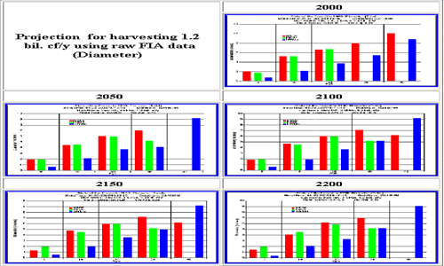 |
Next in the contents list you can click on any of the years in the ![]() option to get a page with four
graphs, one for each attribute for the simulation year chosen (See example in
Fig 4 below).
option to get a page with four
graphs, one for each attribute for the simulation year chosen (See example in
Fig 4 below).
| Figure 4: Area, volume, density and diameter in the year 2000 for a harvest level of 1.2 billion cubic feet/ year (image size adjusted for tutorial) |
 |
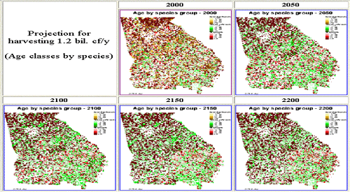
Next on the list are of simulation outputs are the maps.
The option for ![]() offers maps that show age and three species groups at 50 year intervals
from the year 2000 to 2200 (See example in fig 5 below). All of the small
maps in the below graphs can be enlarged with by clicking on them.
offers maps that show age and three species groups at 50 year intervals
from the year 2000 to 2200 (See example in fig 5 below). All of the small
maps in the below graphs can be enlarged with by clicking on them.
| Figure 5: Maps by Area and Species |
 |